Logos 8 arrived earlier this month, and FaithLife (Logos’s parent company) was kind enough to send me a review copy. I’ve been using it for the past several weeks now, and what follows are a few of my favorite features along with some constructive criticism.
Canvas
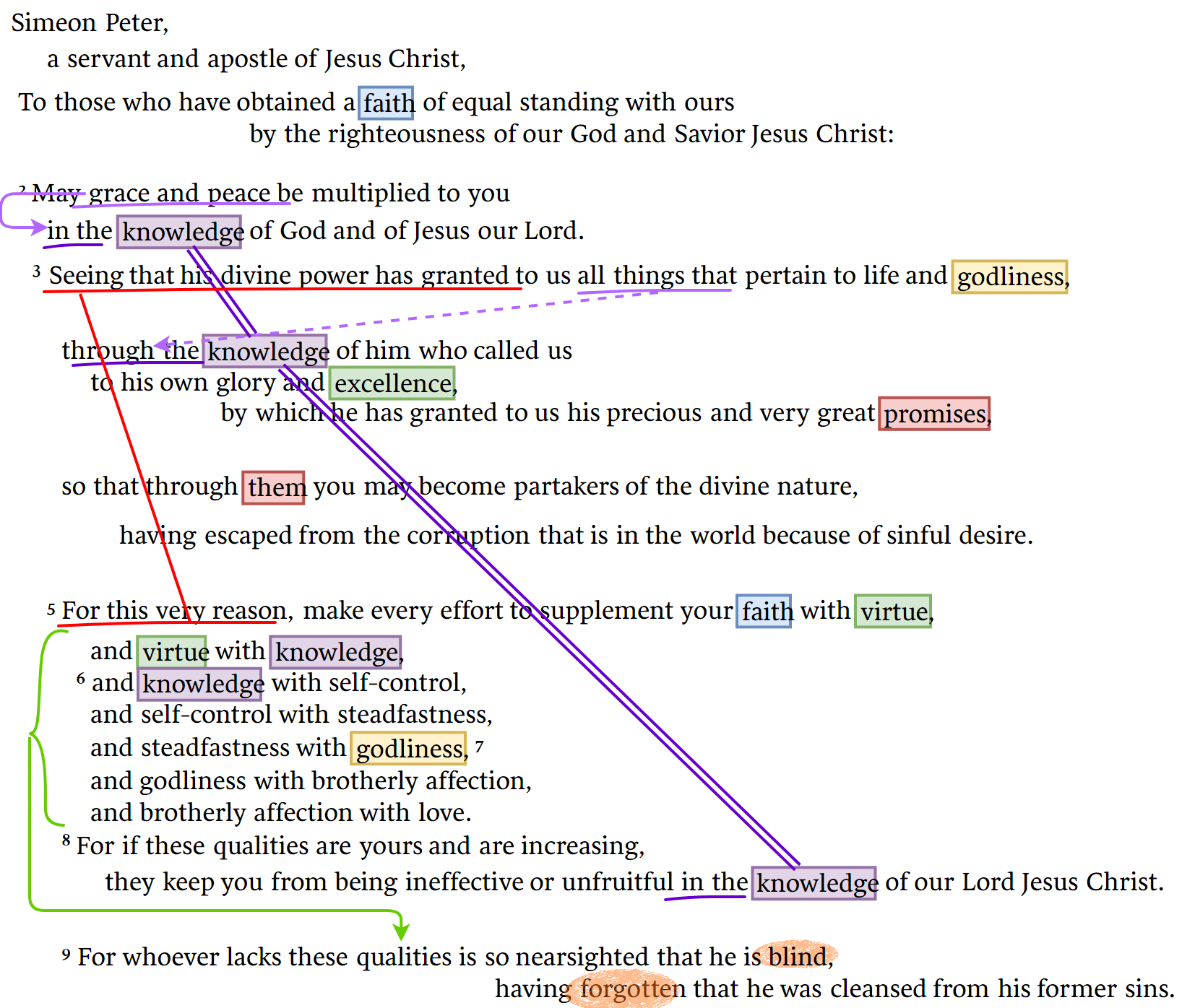
Something that I’ve long wished was part of Logos’s highlighting toolbox is the ability to draw lines between key words in a text. I frankly thought that feature would never come due to technical challenges, but the canvas tool makes it possible to do that and much more. Below is an example I produced fairly quickly using Canvas.
Logos’s own blog post about Canvas shows it being used for more creative, artistic purposes, but expect I’ll use it most often to structure and highlight a passage. Because of this, one feature I hope Logos adds in the future is the ability to use the custom highlighting palates that can be used in other resources within Canvas.
See this page for a video and some other Canvas examples.
Workflows
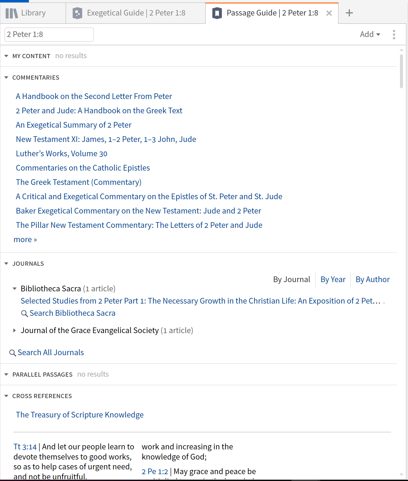
One of the challenges with Logos is sifting through a large library of resources to find those most relevant for one’s present study. One way Logos has addressed this problem in the past has been through passage guides or exegetical guides.
Here are some examples from the passage guide:
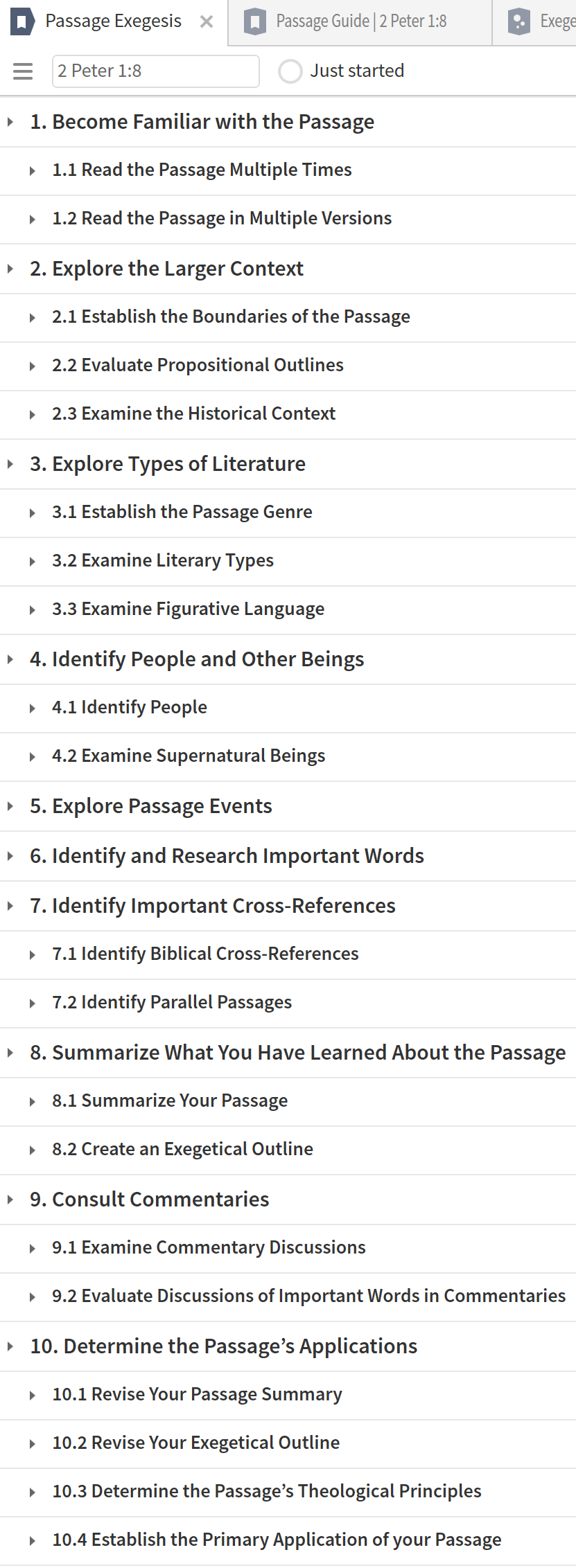
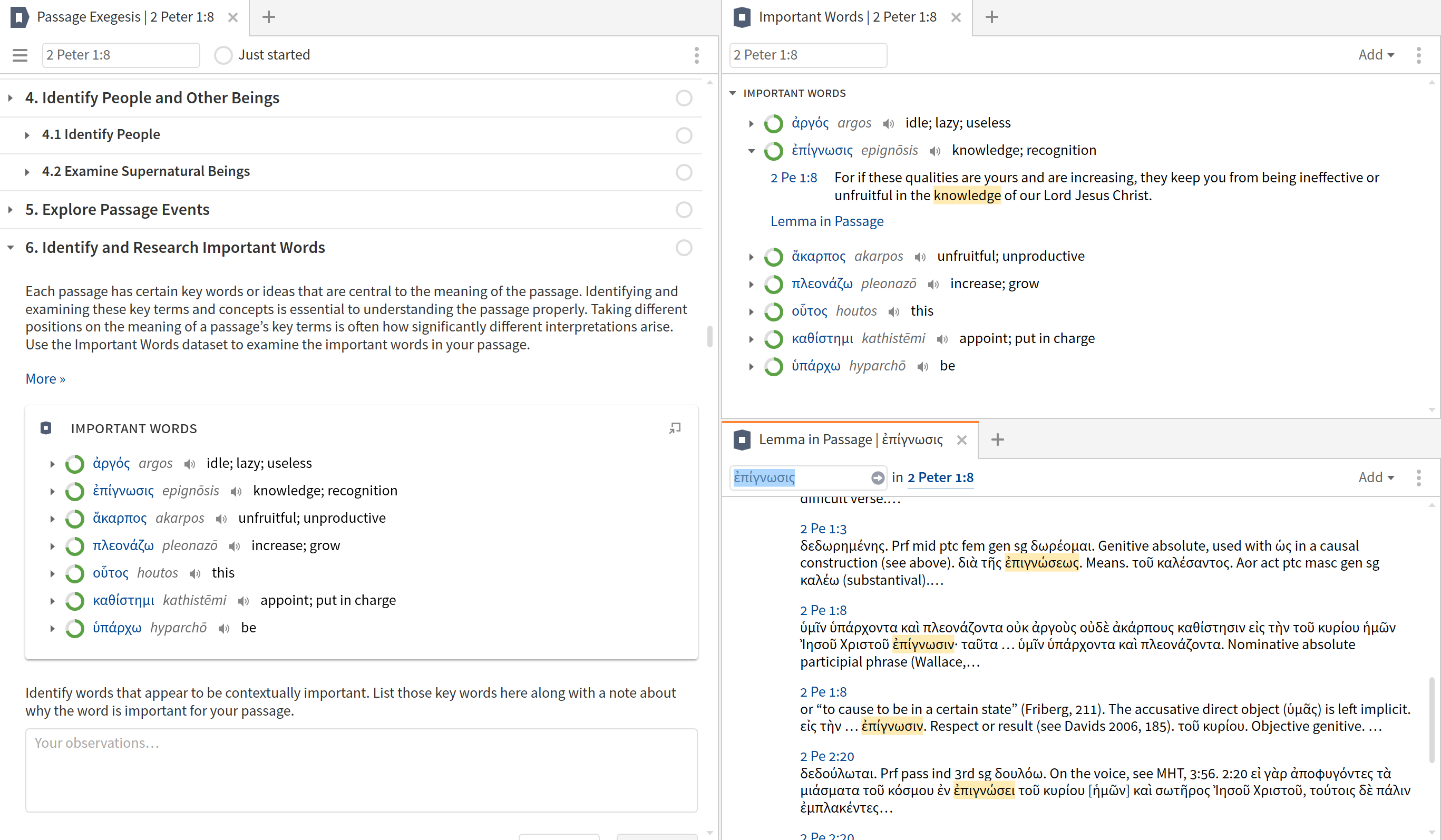
Workflows take this concept to the next level and provide a click-through guide for how to study a passage. Here is the list of steps for the Passage Exegesis Workflow:
Within these steps, the workflow will direct users out to various resources:
Workflows are customizable, so if there are steps that you can do without or do without being prompted by the workflow, you can customize the process.
In addition to workflows that are focused on studying Scripture, Logos also included a workflow for praying Scripture. On the one hand, the process is simple enough that a workflow isn’t really needed, but part of the utility of the workflows is to teach people how to do something. I can also see using this workflow as a way to discipline myself to slow down and be more intentional in praying through Scripture.
For a video about workflows, see here.
Lexham Survey of Theology / Theology Guide
Another new feature of Logos 8, and one to which I contributed, is the Lexham Survey of Theology. Information from this resource is also presented and expanded on in the theology guide.
The LST provides a brief definition of a theological topic followed by an entry which summarizes the topic. Key passages and recommended resources follow the entry. In general, I think the summaries are helpful, though there are some which, unfortunately, seem to argue for a viewpoint instead of surveying positions. I contributed entries relating to the themes of covenant and law and sought to provide a summary of viewpoints followed by suggested resources that represent the range of viewpoints on the topic.
I think the resource recommendations and the key passages may end up being the most useful part of this resource.
For a video about the theology guide, see here.
Touch and Pen
I use Logos on a Surface device, and, in general, it works well with touch. I’ve used the Logos mobile app on both iOS and Android, and while the mobile app is nice, I prefer the full-featured experience on my Surface.
In many ways, Logos 8 improves upon Logos 7 in the realm of touch. The new design for accessing the table of contents within resources is more touch-friendly, as are the new toggles for the interlinear and multiple resources views. However, while the main resources respond to touch, the interactives do not. This is frankly unacceptable. Windows devices have had touch for the past decade, and a program in which touch works only selectively is broken.
Similarly, the pen works everywhere in Logos–except with the notes feature. There is no place where pen functionality is more desirable within Logos. Furthermore, there is no reason why pen functionality should not work here. Microsoft provides the pane for pen input, and the Logos program should not care whether the text is coming from the pen input pane, from an onscreen keyboard, or from a hardware keyboard. It is the only program I have that does not recognize pen input. When a program does not function with a basic operating system feature that works with every other program, it is broken.
Other Features
Logos 8 includes a number of other nice features. For instance, the Library now has a side panel with helpful filters. I find that I use this far more than I might have anticipated. In fact, if I were to organize this post by most used feature, this paragraph would be at the top of the post instead of at the bottom.
The homepage now includes a dashboard that fills up with the users own documents. The advertising is still present, but if you have enough docs on the dashboard, it is tucked away below your docs. This is better than the old homepage. I had my various prayer lists in the sidebar on the old homepage, but it seemed distracting to interact with them as a sidebar to blog posts and advertisements. At least for my workflow, the new homepage is better.
I’m generally happy with the new UI as well. While I did like the big book panel/icon that always appeared on the far left of a resource pane in the old design (and have to retrain myself to go to ellipses on the right of the screen instead of to the left of the screen to access the resource menu), I think the new design is better overall. It’s clearer which tab is active, and the icons within the tab make identifying resources in different tabs a bit easier.
My general assessment is that Logos 8 is a solid and substantial upgrade from Logos 7.


Donald Johnson says
I’m on the subscription model, I forget what they call it, so I automatically got the upgrade. I’ve just started using the Workflow feature. It looks promising.
There are times that I think the Logos folks try to do too much of the thinking for you, but this latest upgrade seems to make the product easier to use.
Maranatha!
Don Johnson
Jer 33.3